Shelf Candy is a meme hosted by Five Alarm Book Reviews and every Saturday, bloggers choose a book whose cover really catches their eye. I know you're not supposed to judge a book by it's cover, but I always do, so I'm choosing books whose cover alone made me pick it up. So I hope you enjoy my shelf candy!
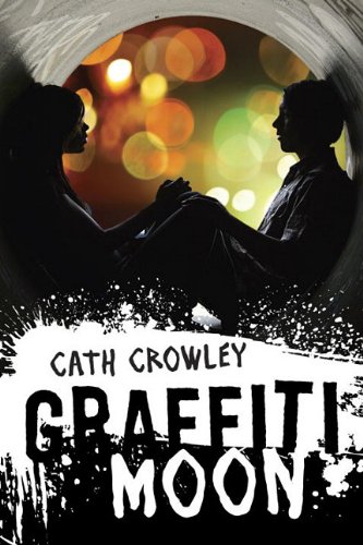
There are tons of things I love about this cover, but the main reason is how the picture and graphics really embrace the title. The paint around the title make it look like paint or graffiti on walls. The colors of the font are also really cool because "Moon" is white, which makes it seems more like a moon against the dark sky. I also love how the silhouettes are shadowed in the tunnel. They seem so mysterious and like they're hiding from the light outside, which is the last thing I love about his cover. The lights in the back are so pretty with the different colors and light spots it seems magical. This cover is just so cool and I love it so much more than the paperback one, where it's just a spray paint can with the title across the bottle. When I read this, I'm definitely going to make sure I read the hardback version just for the cover!


Jessica, this is such a great cover. I agree, there are so many things to love. The backdrop of lights, the tunnel, the intensity of the two in the tunnel and yes, those graphics. This is most definitely one of those covers that makes me want to know more. Thank you so much for posting it.
ReplyDeleteThis book seems so different! looks great!
ReplyDeleteThanks for sharing! I will have to check out this book. I had never heard of it.
ReplyDeleteI love this cover, too! It has so much to look at and it really makes me think! I love the colored lights in the background.
ReplyDelete~Jess
http://thesecretdmsfilesoffairdaymorrow.blogspot.com/